ShopDreamUp AI ArtDreamUp
Deviation Actions


Description
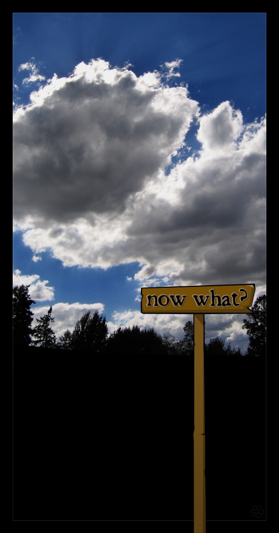
I'm just so damn tired of 2 steps forward and 1 step back...
Photo + Vector
Edit: Made some modifications suggested by ~human-powered
Photo + Vector
Edit: Made some modifications suggested by ~human-powered
Image size
550x1050px 167.94 KB
© 2005 - 2024 Chromakode
Comments14
Join the community to add your comment. Already a deviant? Log In
Well, I would actually try to manip a real sign in stead of making a fake one like this. It doesn't seem very naturall in full view.